ModalForm 是 ProForm 的一个变体,本质上仍然是个表单。所以无法通过 footer 来自定义页脚,如果要定义页脚需要使用 submitter.render 来进行自定义。这两个表单的表现与 ProForm 相同,可以从 ProForm 直接修改而来。本文由浅入深一步一步记录 ModalForm 使用过程。
最小使用
1
2
3
4
5
6
7
8
9
10
11
12
13
14
15
16
17
18
19
| import { Button } from 'antd';
import { ModalForm } from '@ant-design/pro-components';
import { PlusOutlined } from '@ant-design/icons';
export default () => {
return (
<div>
<ModalForm
title="新建项目"
trigger={
<Button type="primary">
<PlusOutlined />新建项目
</Button>
}
>
</ModalForm>
</div>
)
}
|
title: 弹框的标题trigger: 用于触发 Modal 打开的 dom,一般是 button

表单项
一个表单除了 Form 之外还是需要一系列的表单项,ProForm 自带了数量可观的表单项, 这些组件本质上是 Form.Item 和 组件的结合,我们可以把他们当成一个 FormItem 来使用,并且支持各种 props。每个表单项都支持 fieldProps 属性来支持设置输入组件的props。 我们支持了 placeholder 的透传,你可以直接在组件上设置 placeholder。
1
2
3
4
5
6
7
8
9
10
11
12
13
14
15
16
17
18
19
20
21
22
23
24
25
26
27
28
29
30
31
32
33
34
35
| import { Button } from 'antd';
import { ModalForm, ProForm } from '@ant-design/pro-components';
import { PlusOutlined } from '@ant-design/icons';
export default () => {
return (
<div>
<ModalForm
title="新建项目"
trigger={
<Button type="primary">
<PlusOutlined />新建项目
</Button>
}
onFinish={async (values) => {
console.log(values.name);
message.success('提交成功');
return true;
}}
>
<ProFormText
width="xl"
name="name"
label="项目名称"
tooltip="最长为 24 位"
placeholder="请输入名称"
fieldProps={{
maxLength: 50,
showCount: true
}}
/>
</ModalForm>
</div>
)
}
|
onFinish: 提交数据时触发,如果返回一个 true。会关掉抽屉,如果配置了 destroyOnClose 还会重置表单。ProFormText: ProFormText 是 FormItem + Input 的产物,用于输入各类文本
注意:onFinish 是提交表单且数据验证成功后回调事件,同 antd 4 Form 组件 API
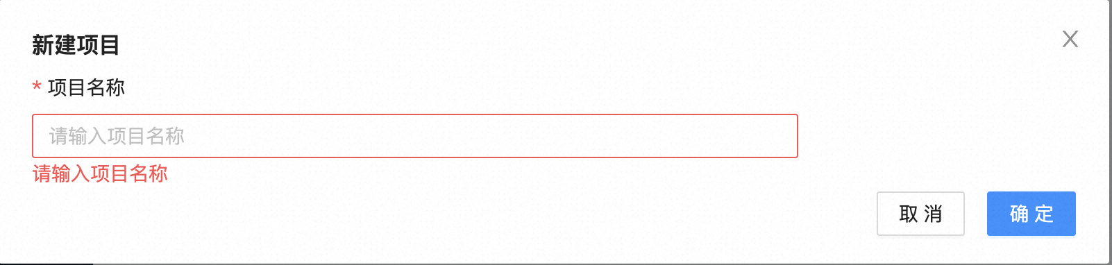
表单校验
1
2
3
4
5
6
7
8
9
10
11
12
13
14
15
16
17
18
19
20
21
22
23
24
25
26
27
28
29
30
31
32
33
34
35
36
37
| import { Button } from 'antd';
import { ModalForm, ProForm } from '@ant-design/pro-components';
import { PlusOutlined } from '@ant-design/icons';
export default () => {
return (
<div>
<ModalForm
title="新建项目"
trigger={
<Button type="primary">
<PlusOutlined />新建项目
</Button>
}
onFinish={async (values) => {
console.log(values.name);
message.success('提交成功');
return true;
}}
>
<ProFormText
width="xl"
name="name"
label="项目名称"
tooltip="最长为 24 位"
placeholder="请输入名称",
rules={[
{
required: true,
message: "请输入项目名称"
}
]}
/>
</ModalForm>
</div>
)
}
|
我们只需要关心业务规则,表单校验通过之后 onFinish 才会被调用。
默认值
优先级:request(ProForm) > initialValues(ProForm) > request(ProFormItem) > initialValue(ProFormItem)
1
2
3
4
5
6
7
8
9
10
11
12
13
14
15
16
17
18
19
20
21
22
23
24
25
26
27
28
29
30
31
32
33
34
35
36
37
38
39
40
41
42
43
44
45
| import { Button } from 'antd';
import { ModalForm, ProForm } from '@ant-design/pro-components';
import { PlusOutlined } from '@ant-design/icons';
export default () => {
return (
<div>
<ModalForm
title="新建项目"
trigger={
<Button type="primary">
<PlusOutlined />新建项目
</Button>
}
request={async () => ({
name: "紫升的项目1"
}}}
initialValues={{
name: "紫升的项目2"
}}
onFinish={async (values) => {
console.log(values.name);
message.success('提交成功');
return true;
}}
>
<ProFormText
width="xl"
name="name"
label="项目名称"
tooltip="最长为 24 位"
placeholder="请输入名称",
request={async () => "紫升的项目3"}
initialValue={"紫升的项目4"}
rules={[
{
required: true,
message: "请输入项目名称"
}
]}
/>
</ModalForm>
</div>
)
}
|
modalProps
Modal 的 props,使用方式与 antd 相同。注意:不支持 ‘visible’,请使用全局的 visible,比如关闭时重置表单的 destroyOnClose 就在这里配置。
1
2
3
4
5
6
7
8
9
10
11
12
13
14
15
16
17
18
19
20
21
22
23
24
25
26
27
28
29
| import { Button } from 'antd';
import { ModalForm, ProForm } from '@ant-design/pro-components';
import { PlusOutlined } from '@ant-design/icons';
export default () => {
return (
<div>
<ModalForm
title="新建项目"
trigger={
<Button type="primary">
<PlusOutlined />新建项目
</Button>
}
modalProps={{
destroyOnClose: true
}}
>
<ProFormText
width="xl"
name="name"
label="项目名称"
tooltip="最长为 24 位"
placeholder="请输入名称"
/>
</ModalForm>
</div>
)
}
|
destroyOnClose: 默认 ModalFrom 关闭后,表单不会重置,需要单独配置。
其他属性
autoFocusFirstInput: 自动聚焦第一个输入框submitTimeout: 提交数据时,禁用取消按钮的超时时间(毫秒)。